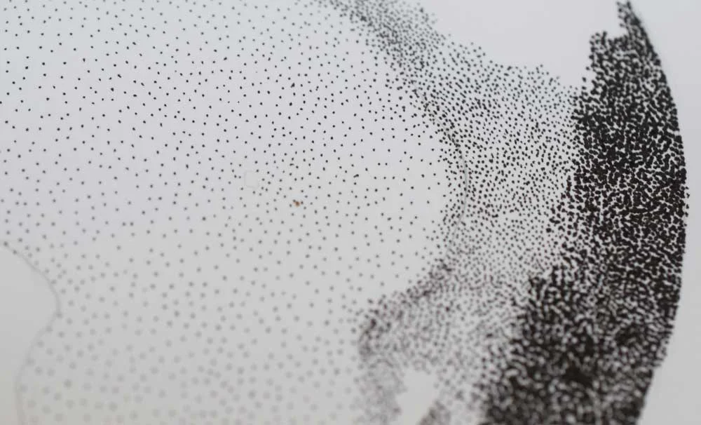
One of my favorite techniques to use is stippling. In the simplest definition, stippling is the act of making small dots or marks on a piece of paper to create an image. Using this technique you can create value by using different sized dots and spacing them further or closer from one another. Value is the lightness and darkness in a color or shade. The value is so important to the overall success of a drawing or painting as it creates depth and dimension. This is a really fantastic technique to help you better 'see' value. It is a slow technique that requires patience but can also be very meditative in the same way coloring can be.
Let's get started by talking about equipment.
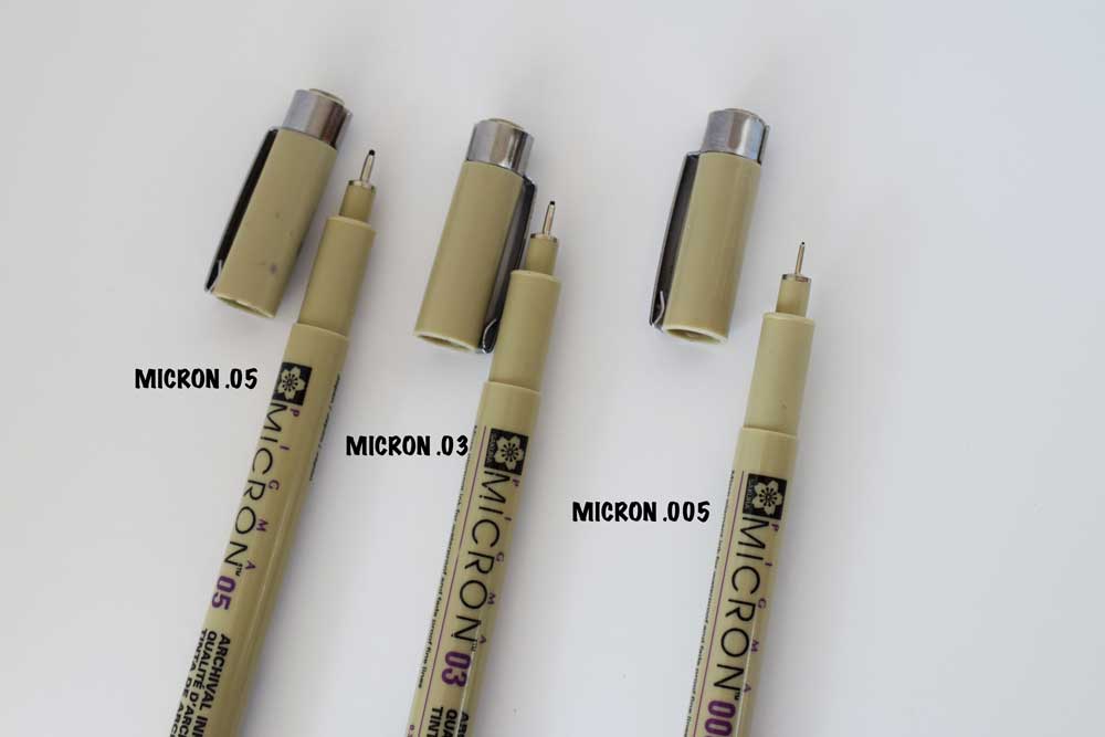
I think these Pigma Micron pens are great. They are relatively inexpensive, come in different colors, and have different nib sizes. You can get them in any local craft store in the fine art section. The down side to these pens is that the nibs are delicate and get damaged pretty easily. Also, the ink can dry up quickly. I go through these like crazy.
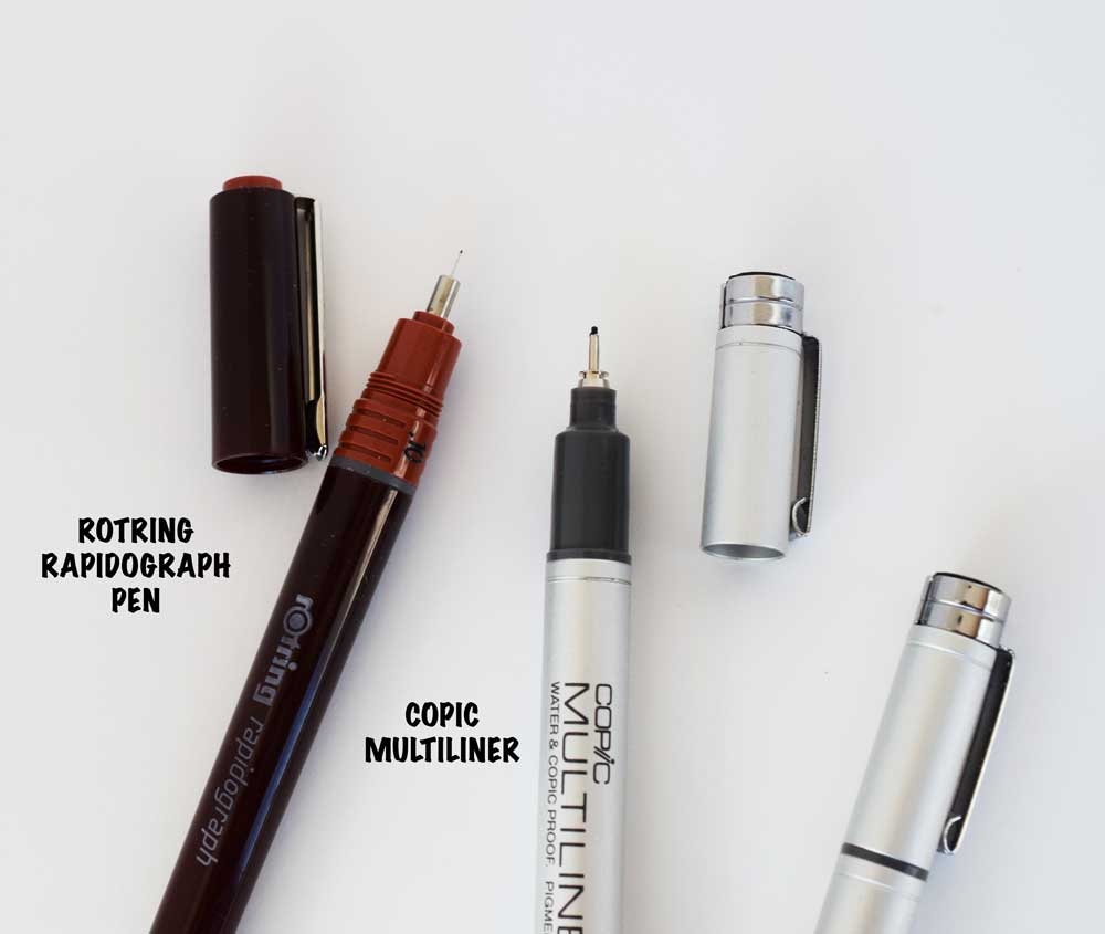
Here are a couple of other options. The copic multiliner is a tad more expensive than the pigma. The ink lasts a really long time and you can buy replaceable nibs, which I love. You can sometimes find these in the art store but you may have to look at a fine art supply store or online for these.
The rotring radiograph pen is the most expensive of the pens mentioned. It is a lovely pen. It has replaceable ink cartridges and really fine tips. Lots of professionals use this pen. It will likely have to be ordered online if you don't have a specialty fine art store. I have read a lot of reviews about these pens clogging but I have not had that problem. Also, be sure to order ink that is waterproof if you are planning on using it with water media.
There are a lot of different pens out there that you can try. These are just a small range of samples that I have tried and liked. There is usually a display at the art store that offers testers so give them a try and see what you like.
For paper, you will want something smooth. I used BRISTOL in this example. You want to avoid textured watercolor paper which is harder for this fine detail work. I have also used 90lb mixed media paper. Hot pressed watercolor paper is also very smooth. Here is an example I found so you can see what I mean.
Lastly, you will need a pencil and eraser. I love to use a simple mechanical pencil but any pencil will do. You will be making a light sketch as a guide and erasing it later.
Let's get started by learning the technique and making a value chart at the same time.
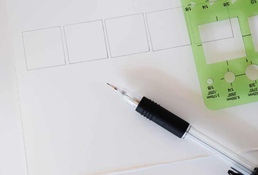
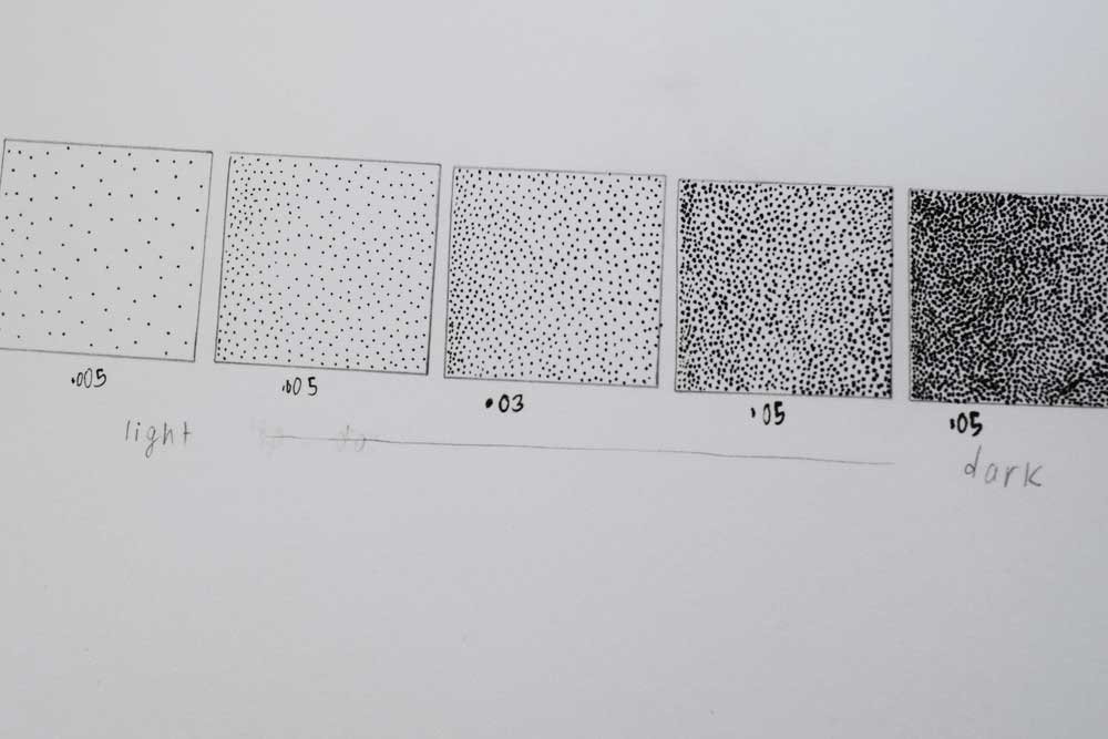
I used my pencil and square stencil to create my practice boxes. I made five in total.
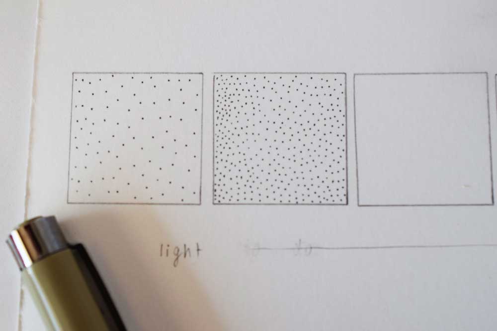
Get your pens. You don't have to have different sizes. You can make this effect using only one size of nib but the effect is more dramatic with different sizes. I am making my lightest value first. I fill the box with dots that are spaced apart far from one another. In the next box, I space my dots closer together. Now stand back and take a look. See the effect of spacing the dots closer? At this point I change pens for a thicker nib and space my dots even closer to one another.
For the last two boxes I used an even thicker nib and made my dots closer. It is a good idea to label the size pens you used so now you have a reference guide.
Now find a visual reference to practice your new technique.
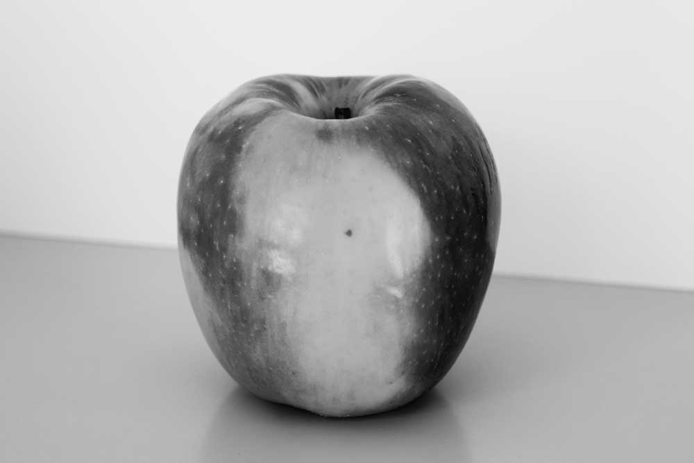
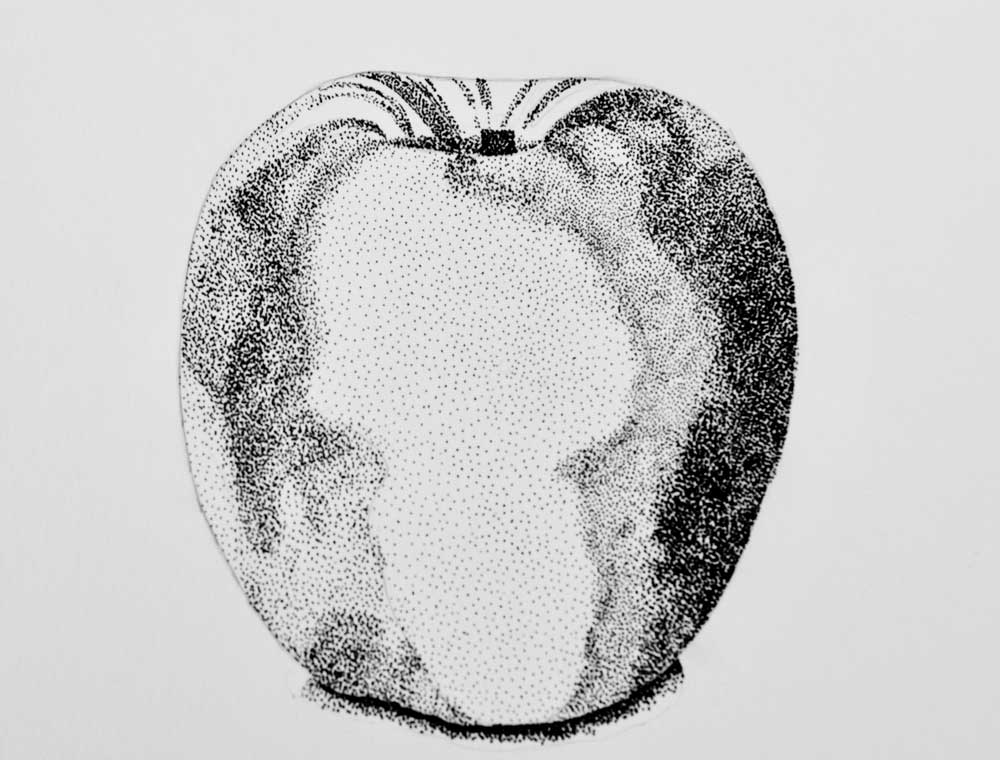
I chose this apple because it had a nice color variation. Start by observing. Where is the darkest dark and lightest light? Darkest dark is a good place to start because it gives a baseline for you to compare and contrast to. I see the stem as the darkest value right away. Some of the colors can be a little trickier. One way of seeing darks is by squinting. Try it! It really works. Another way to help see values is by printing your reference in grayscale or black and white.
If you have photo editing software you can turn up the contrast which also helps. It really helps to see the darker parts of the red doesn't it? You can also note the shadow where the apple meets the table. The shadow then gets lighter as it moves away from the apple. This helps you identify where the light source is.
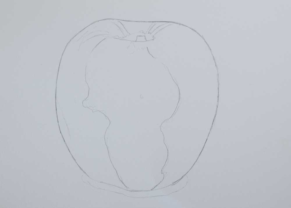
Make a nice light sketch of your reference. You can just eyeball it or you could print it out, tape it on a sunny window with your sketch paper taped over the top of it and trace a quick outline. It helps to roughly block out the dark areas.
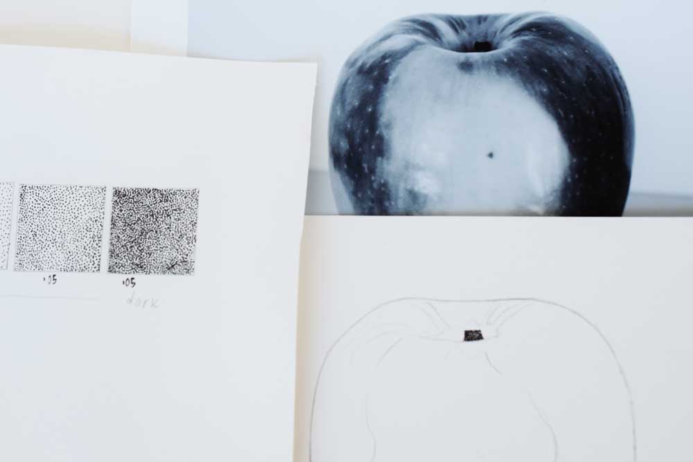
Using your value chart and your reference image, fill in the darkest area. I started with the stem.
Start filling in the different values you see. In the transition areas you will have to overlap to make it look more smooth and blended.
As you are working, step away from your drawing and come back to gain perspective and get a fresh eye. Another way of getting a fresh perspective is to take a photo of your work. Many times a photo picks up some interesting things that your eye doesn't. Keep adding until you are satisfied with the overall look. That's all there is to it! You have practiced stippling, learning to see value and created an elegant image to impress your friends!
Thanks for stopping by!
Warmly,
Pam
